DIY Balancing Stones - Tumi Ishi
Posted by DecoArt on Jul 21st 2022
Create a mindful interactive decor piece. Also known as Tumi Ishi, these DIY balancing stones are a fun bright and mindful addition to your space.
SUPPLIES
- Almondine (DA403-3)
- Portobello (DA411-3)
- Red Spice (DA404-3)
- Tiger Lily (DA415-3)
- Strawberry (DA416-3)
- Sunset Gold (DA405-3)
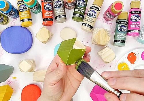
- Sprout (DA406-3)
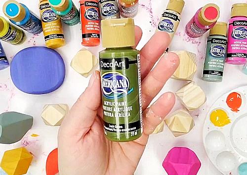
- Laurel (DA407-3)
- Lush Green (DA408-3)
- Paradise Green (DA414-3)
- Perfect Peri (DA410-3)
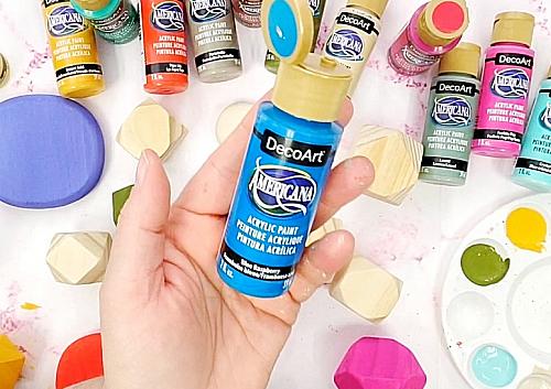
- Blue Raspberry (DA413-3)
- Purple Iris (DA412-3)
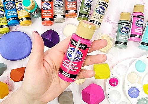
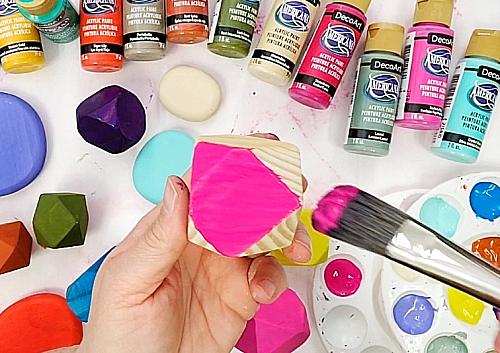
- Fuchsia Pop (DA417-3)
- Crystal Blue (DA409-3)
- -fine grit sandpaper
- 3/4" Oval Brush
- wood stacking balance stones
- Wood stacking stones
INSTRUCTIONS
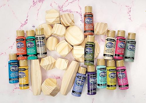
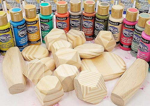
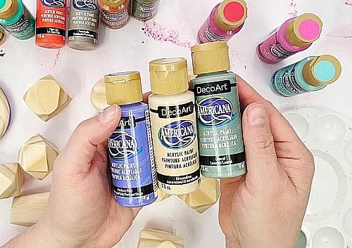
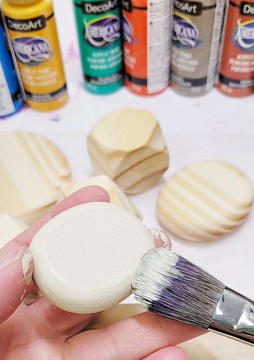
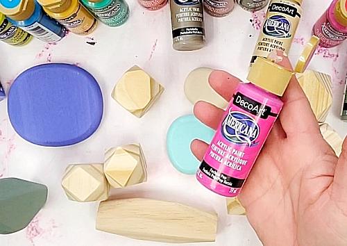
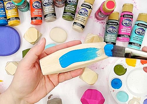
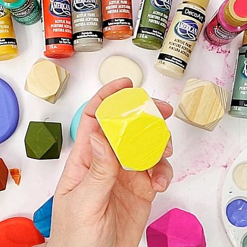
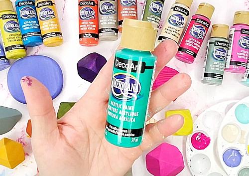
- Gather supplies for this project including: wood shapes, new 2022 Americana Acrylic colors, a soft brush and some fine grit sandpaper.
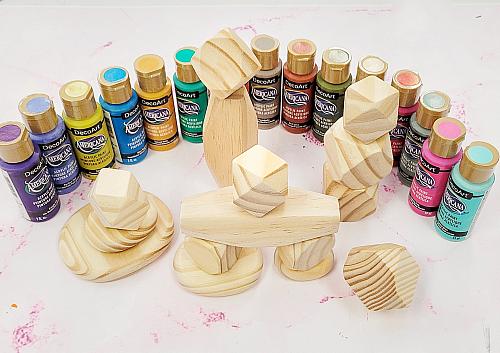
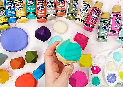
- Choose a variety of interesting wood shapes.
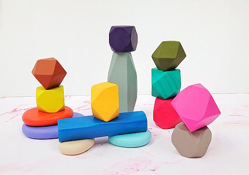
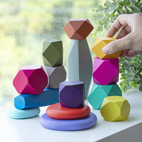
- Optional: plan stacking options to think about color placement. I chose 15 pieces to have every new Americana color represented.
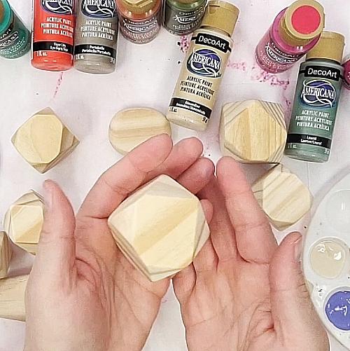
- Prep your wood pieces by lightly sanding and wiping clean.
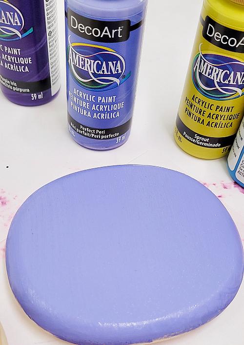
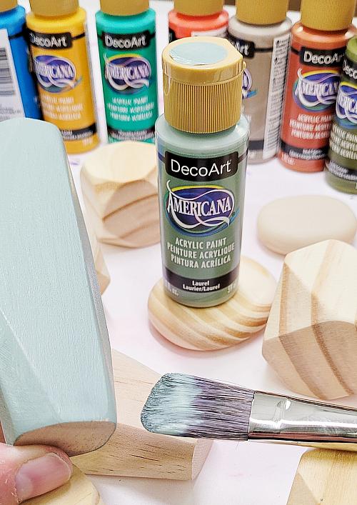
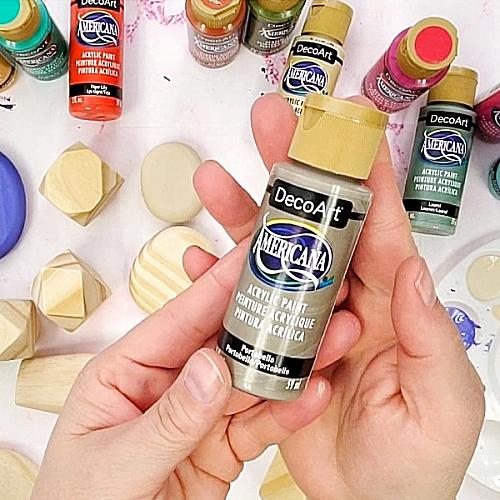
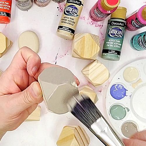
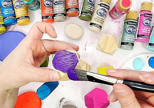
- The first three colors I chose to use were Perfect Peri, Almondine and Laurel.
- A 3/4" oval brush will minimize brush strokes.
- Perfect Peri IS perfect!
- Laurel is a soft green color that would be beautiful to use in a Boho vibe project!
- Next, I chose Portobello. Again, a beautiful soft color.
- Goes on so nicely.
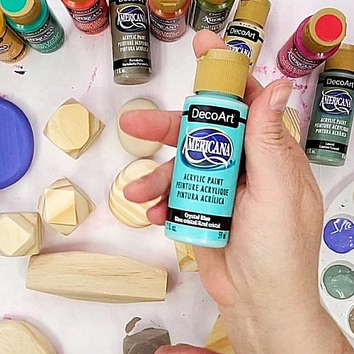
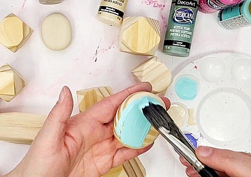
- Crystal Blue works great with the other colors.
- Americana paints self level and are a great paint to use for many different surfaces.
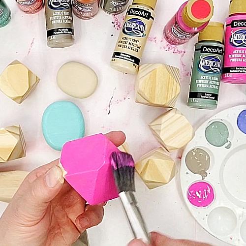
- There are some bright colors that are so vibrant in the new 2022 colors. The first is Fuchsia Pop.
- The vibrant pigment really stands out on light wood.
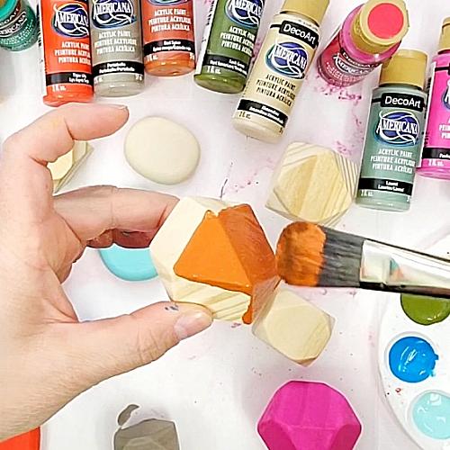
- Tiger Lily is the next color.
- Again, the color is vibrant and bright.
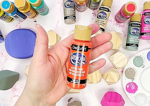
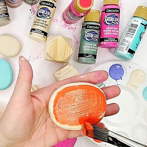
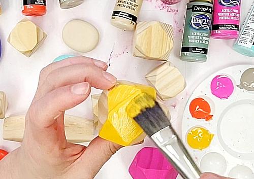
- Sunset Gold brings some nice summer vibes.
- Paints on beautifully.
- Lush Green is a nice playful color.
- It grounds the colors to nature.
- Blue Raspberry is a self proclaimed summer favorite!
- Brushing out this color made me want a ice pop.
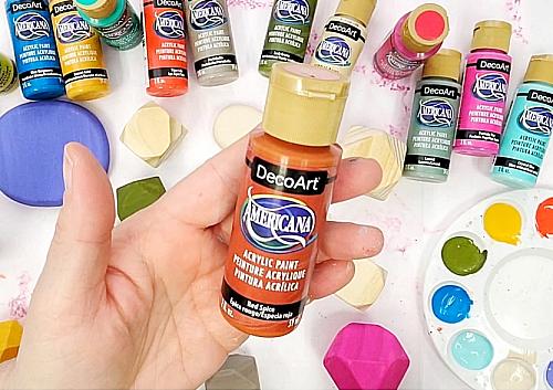
- Red Spice is another color that would go beautifully in a Boho or muted color palette project.
- This color looks so nice with the Lush Green.
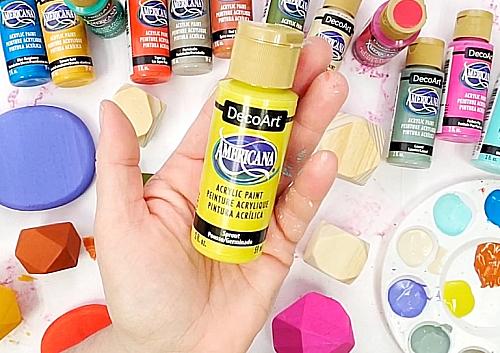
- Sprout is color in the green family, but closer to yellow.
- Nice and bright.
- Purple Iris is a deep gemstone color. (TIP: Keep in mind when painting out this color if the pigment layers, it starts to go darker.)
- Another pink similar to the Fuchsia Pop is the Strawberry.
- This color with the Blue Raspberry and some of the other bright colors would make a fun summer color palette for a project!
- Paradise Green is giving mermaid or jungle vibes.
- What is nice about using wood with the bright Americana colors is that they allow the wood grain to show through for a cool effect. Allow wood pieces to dry. Sand lightly again and wipe clean. Add a second coat. Allow to dry. Optional: coat with a DuraClear Varnish such as the Ultra-Matte, for an added surface protection.
- This project is super easy and fun to do. Painting out all of the colors is a mindful practice in itself, but having these beautiful stackable shapes near helps bring you into the present every time you balance them.