Color Wheel and Color Theory
Posted by DecoArt on Oct 18th 2022
THE COLOR WHEEL
October 12, 2021
Understanding the basic principles of tne color wheel and color theory can greatly enhance your creative endeavours. Whether you're a painter, a home renovator, or looking to put together a stunning outfit; understanding color theory is the key to making harmonious color schemes and creating with confidence.
LEARN THE COLOR WHEEL AND COLOR THEORY
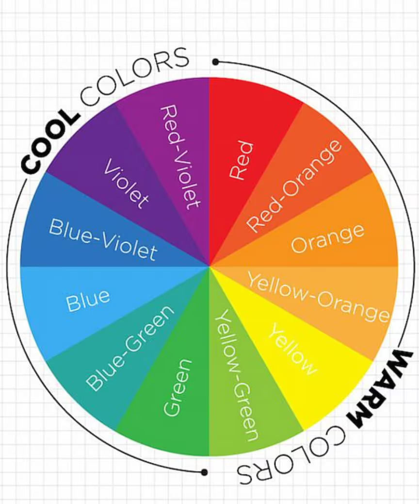
The color wheel is an illustrative tool used to help us define colors and their relationships to one another. The first one was invented in 1666 by Sir Issac Newton and several variations have been used since then. You're probably familiar with the color wheel taught in most art classes, but did you know it's not the only one?
The study of color theory has a long and storied history dating all the way back to Aristotle. Back then, philosophers discussed the mixing of colors and how they could be used to produce new ones. Later on, scientists studied the influence of light and how it impacts what colors we can see and why.
A more modern approach to the study of color can be seen around the 18th century when we began to define terms we still use today, such as primary colors. From there the artistic tradition of color theory split away from the scientific. While science focused on our vision in relation to color, artists focused on how colors could be created, combined, and used.
In the artistic world today, color theory is defined as practical guidance for visual artists and designers that helps them come up with color schemes, mix colors, and define colors as we see them. And the main tool used to help artists understand these relationships is the color wheel.
Want to explore painting your own color wheel? The Color Wheel Paint Set is a great way to dive in.
There are two main methods of producing color, subtractive or additive. But why? It all comes back to light and the way our eyes interpret it to see color. An additive color wheel reflects how different wavelengths of lights can create visible color. The subtractive color wheel shows us how a color looks to us when white light, such as sunlight, reflects off of an object.
If you're confused, try to think of it this way. Have you ever looked up close at a computer or TV screen? If you do you can see it starts out black and then the pixels, or pinpoints of light, that make up the screen light up and show you images. Digital screens like this use an additive color method, by beginning as black and then mixing different amounts of colored light they can create all the colors in the visible light spectrum. On this color wheel, the primary colors are red, green, and blue.
A subtractive color wheel is what we commonly think of as the painter's color wheel. Subtractive colors start from white, and then colorants are used to cause the surface to reflect a different color back to our eyes. This can be paint, dye, pigment, or anything else. On a subtractive color wheel, the primary colors are red, yellow, and blue...
HOW TO USE THE PAINTER'S COLOR WHEEL
For the purposes of painting, you really only need to know about the Painter's color wheel. Still, isn't it interesting how light impacts what our eyes see? On the painter's color wheel colors are divided into 3 main groups: primary, secondary, and tertiary colors. A subtractive color wheel is what we commonly think of as the painter's color wheel.
Subtractive colors start from white, and then colorants are used to cause the surface to reflect a different color back to our eyes. This can be paint, dye, pigment, or anything else.
PRIMARY COLORS
On a subtractive color wheel, the primary colors are Red, Yellow, and Blue. These three primary colors are the foundation of the color wheel. They are called the primary colors because their true color pigments cannot be created by mixing any other combination of colors and all other colors in the color wheel are derived from these three hues. When painting it is important to have a true red, blue, and yellow to help you mix a variety of other colors.
SECONDARY COLORS
Secondary colors are created by mixing equal parts of two primary colors together.
-
Red + Blue = Violet
-
Red + Yellow = Orange
-
Blue + Yellow = Green
TERTIARY COLORS
In total, there are six tertiary colors. Tertiary colors are created by mixing equal parts of primary and secondary color together.
- Blue (primary) + Violet (secondary) = Blue-Violet
- Red (primary) + Violet (secondary) = Red-Violet
- Red (primary) + Orange (secondary) = Red-Orange
- Yellow (primary) + Orange (secondary) = Yellow-Orange
- Yellow (primary) + Green (secondary) = Yellow-Green
- Blue (primary) + Green (secondary) = Blue-Green
SHADES, TINTS, AND TONES
If you have a favorite color that isn't represented in the color wheel, there may be a reason for that! Various tints, shades, and tones can all be derived from these 12 basic colors. A tint is when an artist adds white to make a lighter color. For example, pink is actually a tint of the color red. Americana Acrylics has a great variety of all colors including pinks!
Hue
The hue is the original pure color.
Tint
The tint of a color is created by adding white to make a color variation of that color. For example, pink is actually a tint of the color red. Americana Acrylics has a great variety of all colors including pinks.
Shade
A shade is created by adding black to a color hue to darken that color.
Tone
Tones are created by adding gray to a color.
A shade is created when an artist adds black to darken a color. A little goes a long way with black paint, so try adding just a touch to see what deep and dramatic shades you can make out of your favorite colors. Similarly, a tone is made when gray is added to a color. Try this when you want an even subtler version.
When painting, mixing the colors you're using with a small amount of white or black is an easy way to create natural-looking highlight and shadow colors. Try this technique yourself and see what you can mix up! Some artists will create entire paintings using shades and tints from just one color for a monochromatic look.
One of the best ways to get familiar with the color wheel is to create one yourself. Experiment with your own style and explore how colors work together.
ALL ABOUT COLOR GROUPS
One of the main uses of the color wheel is to help us recognize the visual relationships between colors. By looking at the placement of colors on the color wheel, we can come up with groupings of different colors that work well with one another for a variety of purposes. Below are some basic color schemes you can refer back to when choosing colors for your palette.
COMPLIMENTARY COLORS
Complementary colors are two colors that are directly across from one another on the color wheel. These pairings are usually high-contrast and bold. While these complete opposites may not seem like they work well, together they brighten and strengthen one another for a high-impact look.
ANALAGOUS COLORS
An analogous color scheme consists of three neighboring colors on the color wheel. Pick one color to be the primary color, and the two colors adjacent to it on either side to make your own analogous color scheme. Their proximity on the color wheel makes analogous color schemes harmonious and subtle.
TRIADIC COLORS
A triadic color scheme consists of three colors that are equally spaced apart on the color wheel in a triangular shape. Triadic color schemes are bolder than an analogous color scheme and create some wonderful contrast and vibrant looks.
SPLIT COMPLEMENTARY COLORS
A split-complementary color scheme is similar to a complementary color scheme. Instead of using two colors directly across from one another on the color wheel, it uses three colors: one primary color and then the two colors adjacent to its complement. Split-complementary color schemes work best with one color acting as the dominant color and the other two used as accent colors, to avoid looking too busy.
TETRADIC COLORS
Also called a rectangular color scheme, a tetradic color scheme features 4 colors spaced apart in a rectangular shape. This will help you choose two complementary color pairings that work well together, allowing for colorful yet harmonious combinations.
SQUARE COLORS
A square color scheme is 4 colors equal distance apart from one another. Square color schemes are bold, vibrant, and w